A chart pattern is a visual formation on a price chart that provides insight into where prices might move next. These patterns reflect market behavior by forming patterns over time. These patterns give clues about what price might do next, helping you spot potential continuations or reversals in the market.
But here’s the thing — chart patterns alone shouldn’t be the only reason to enter a trade. They are just one piece of the puzzle. You should always combine chart patterns with other market factors like trends, volume, and key price levels.

What Are Chart Patterns?
Chart patterns are price formations that develop as buyers and sellers interact in the market. They appear across all timeframes, from daily charts to minute-by-minute movements, making them useful for all types of traders.
These patterns tell a story about who is in control — buyers or sellers — and can help traders anticipate the next move. Some patterns suggest that prices will keep moving in the same direction, while others warn that a trend might be about to reverse.
As a trader, your job is to recognize these patterns, understand what they represent, and use them alongside other tools.

How Do Chart Patterns Help Us?
Chart patterns help you understand what might happen next in the market. But remember, patterns don’t guarantee anything — other things like volume, market trends, and news also matter.
Here’s why chart patterns are useful:
Help find good trades: Patterns can show when a stock might be getting ready to go up or down, helping traders decide when to buy or sell.
Show where the price might go: By spotting patterns, you can get an idea of whether a stock will keep moving in the same direction or change.
For example, let’s say you spot a double-top pattern forming. This pattern suggests that after reaching a certain level twice, the price might drop. By recognizing it early, you can prepare for the move and trade accordingly.
But don’t trade just because you see a pattern. Always check other things like volume and market conditions to make sure the pattern is strong. Patterns help, but they work best when used with other tools!
The #1 Mistake Traders Make with Chart Patterns

A lot of traders make the mistake of trading patterns in isolation — meaning they only look at the pattern and ignore everything else.
This is a big mistake.
Just because a pattern appears doesn’t mean it will work! You need to check other factors like volume, trends, and market conditions.
For example, if a bullish pattern appears but the stock has bad news or is in a strong downtrend, the pattern might fail.
Types of Chart Patterns
There are two main types of chart patterns:
Continuation Patterns – Indicate that the trend is likely to continue.
Reversal Patterns – Signal that the trend may be about to change direction.
Continuation Patterns
A continuation pattern forms when the price takes a break before continuing in the same direction. Think of it as a resting phase, where buyers or sellers regain momentum before pushing the price further.
These patterns often appear during an uptrend or downtrend when the market slows down for a while but doesn’t fully reverse. Once the pattern is complete, the price usually breaks out in the same direction as before, confirming that the trend is still intact.

Here is how it looks on the actual chart

But here’s the catch — not all continuation patterns lead to a continuation. Sometimes, market conditions change, and price breaks out in the opposite direction, causing a trend reversal instead. That’s why it’s always important to wait for confirmation before making a trade.
Reversal Patterns
A reversal pattern signals that a trend might be coming to an end. Unlike continuation patterns, which show the price taking a pause before continuing, reversal patterns show that buyers or sellers are losing strength and that the market could be gearing up for a trend change.
These patterns often form after a strong uptrend or downtrend, where the price starts to slow down and struggle to make new highs or lows. When the pattern completes, the price may move in the opposite direction, marking the start of a new trend.

Here is how it looks on the actual chart

However, just like continuation patterns, not all reversal patterns guarantee a trend change. Sometimes, external factors like news or major economic events can cause prices to continue moving in the same direction despite the pattern forming. That’s why it’s always smart to use other confirmations — like volume and key price levels — before assuming a trend reversal is about to happen.
Now, let's look at some of the chart patterns.
Rectangle Pattern
A rectangle pattern happens when the price moves between two horizontal levels, creating a clear range where buyers and sellers keep the market balanced. The top line acts as resistance, stopping the price from going higher, while the bottom line acts as support, stopping the price from going lower.
For a rectangle pattern to be valid, the price needs to touch both the support and resistance levels multiple times. These levels don’t have to be perfectly straight in real-world charts — they might have a slight slope, but the general idea remains the same.

This pattern represents a battle between buyers (bulls) and sellers (bears). The market is consolidating, meaning it’s taking a break before deciding on its next move.
The Rectangle pattern can act as either a continuation or a reversal pattern, depending on how the price breaks out.
If it is a reversal pattern, the price is trending in one direction before the rectangle, but instead of continuing, it breaks out in the opposite direction. This means the trend has lost strength, and the market is changing direction. Rectangles that form at the top or bottom of a trend are more likely to turn into reversals, similar to patterns like Double Tops or Double Bottoms.
If it is a continuation pattern, the price was already trending in one direction before the rectangle formed. After consolidating between support and resistance, the price breaks out in the same direction as the previous trend, continuing its move. This happens because the market was just taking a short pause before resuming its trend. Continuation rectangles are more common when the market is already in an uptrend.
If the pattern is a continuation, it can be either a bullish rectangle or a bearish rectangle.
Bullish Rectangle
Forms during an uptrend when the price consolidates before breaking higher. The breakout confirms that buyers are still in control, and the trend is likely to continue.

Here is how it looks on the actual chart

Bearish Rectangle
Forms during a downtrend when the price moves sideways before breaking lower. The breakout confirms that sellers are still in control, and the trend is likely to continue downward.

Here is how it looks on the actual chart

Double Top and Bottom
Double Top and Bottom are the reversal patterns and signals that a trend is about to change direction after a strong move, either up or down.
Let's take a look at both of them.
Double top
A double top is a chart pattern that signals a possible trend reversal after the price has been moving up for a while. It forms when the price tries to go higher twice but fails at the same level, showing that buyers are losing strength.

How a Double Top Forms
The price moves up in an uptrend until it reaches a high point where it struggles to go higher. This creates the first top. After that, the price pulls back and finds support at a lower level, called the neckline.
Buyers try again to push the price back up, but they fail to break above the first top. This forms the second top, a sign that buyers are running out of power.
The pattern is only confirmed when the price breaks below the neckline with strong selling pressure. This confirms that sellers are in control, and the price is likely to drop further. If the neckline doesn’t break, the pattern is not valid, and the price may continue moving sideways or even go back up.
Psychology Behind Double Top Pattern
At first, buyers are in control as price pushes higher. When the first top forms, sellers step in and push the price back down. This is normal — it’s just a pullback.
But when buyers try to take control again and the second rally fails to break the first top, it’s a warning sign. It shows that buyers are getting weaker. Sellers step in again, and if they manage to break the neckline, it confirms the buyers have lost control. The trapped buyers who expected a breakout now start exiting, adding more selling pressure.
This shift — from buyer strength to buyer weakness and rising seller aggression — is what makes the double top such a powerful reversal signal.
Double Bottom
A double bottom is a chart pattern that signals a possible trend reversal after the price has been moving down for a while. It forms when the price tries to go lower twice but fails at the same level, showing that sellers are losing strength.

How a Double Bottom Forms
The price moves down in a downtrend until it reaches a low point where it struggles to go lower. This creates the first bottom. After that, the price bounces up and finds resistance at a higher level, called the neckline.
Sellers try again to push the price lower, but they fail to break below the first bottom. This forms the second bottom, a sign that sellers are running out of power.
The pattern is only confirmed when the price breaks above the neckline with strong buying pressure. This confirms that buyers are in control, and the price is likely to rise further. If the neckline doesn’t break, the pattern is not valid, and the price may continue moving sideways or even drop again.
Psychology Behind Double Bottom Pattern
Sellers are in control during the downtrend. When the first bottom forms, some buyers step in and push the price higher. But the sellers aren’t done — they try again to break that low.
When they fail to make a lower low and the price bounces at the same level, it shows that sellers are losing their grip. If the price then breaks above the neckline, it confirms buyer strength. Short sellers get trapped and start covering, while new buyers enter the market — fueling more upside momentum.
Triple Top and Bottom
Triple top and triple bottom are reversal patterns, just like double tops and bottoms—but with one extra test of the key level. That extra attempt gives traders more confirmation that the trend is weakening and a reversal may be coming.
Let’s look at each one.
Triple Top
A triple top forms after an uptrend when the price tries three times to break through the same resistance level but fails each time. This repeated rejection shows that buyers are getting exhausted.
Here’s how it works:
- The price is trending up and hits a resistance level — that’s the first top.
- It pulls back, then tries again — second top.
- It pulls back again, then makes one last push — third top.
If the price fails all three times and then breaks below the neckline with strong selling pressure, the triple top is confirmed. That breakdown is the signal to look for short opportunities.
If the neckline doesn’t break, the pattern isn’t valid — the market could just be consolidating.

Psychology Behind Triple Top
The psychology behind triple tops is simple — buyers are getting exhausted.
At first, buyers are aggressive and push the price higher. But sellers step in and stop the move.
Buyers try again, but once more, sellers take control.
Then buyers give it one more push, but they still can’t break through.
After three failed attempts, it’s clear buyers aren’t strong enough to move the price higher. Sellers are in control. Once the neckline breaks, the pattern confirms — and that’s when the real move begins.
Triple Bottom
A triple bottom is the opposite. It shows up after a downtrend and signals that sellers are losing control.
Here’s how it forms:
- The price drops and hits a support level — first bottom.
- It bounces, then retests the level — second bottom.
- It pulls back one more time — third bottom.
When the price fails to break lower all three times and then finally breaks above the neckline with strong buying volume, the triple bottom is confirmed. That breakout is your signal that buyers have taken control.
Again, if there’s no break above the neckline, there’s no valid setup — it could just be sideways movement.

Psychology Behind Triple Bottom
Triple bottoms show the opposite — sellers are losing strength.
At first, sellers are in control and push the price lower. But buyers step in.
Sellers try again — and again — but they can’t push the price below the same level.
Each bounce shows more buyer strength. Sellers are getting tired.
Once the price breaks the neckline, the shift is clear. Buyers take over, and that’s when the real move starts.
Head and Shoulders pattern and Inverse Head and shoulder
Head and shoulders
The head and shoulders pattern is a trend reversal formation that signals a potential shift from an uptrend to a downtrend. It forms when the price makes three peaks: a left shoulder, a higher head, and a right shoulder that fails to break higher.
But here’s the thing — it won’t always look perfect. The peaks might not be exactly the same, the neckline might be slightly tilted, and sometimes the right shoulder forms higher or lower than the left. That’s normal. What matters is the overall structure and confirmation.
The neckline is the key level. It connects the lowest points between the head and shoulders and acts as support. When the price breaks below the neckline with strong selling pressure, that’s the confirmation of the pattern.

Psychology Behind the head and shoulder Pattern
Understanding what’s happening behind the scenes can make you a better trader. Here’s the psychology behind a Head and Shoulders pattern:
At first, buyers are in control, driving the uptrend. The left shoulder forms, and buyers pull back slightly. Then they come back strong, pushing to a new high — the head. But after that, things start to shift.
The third rally attempt — the right shoulder — fails to make a new high. Sellers are stepping in. Buyers are getting weaker.
As the price approaches the neckline, traders who bought during the head or right shoulder are now seeing losses or smaller gains. Once the neckline breaks, these traders panic, cut losses, and exit their positions. That wave of selling can trigger a strong move downward.
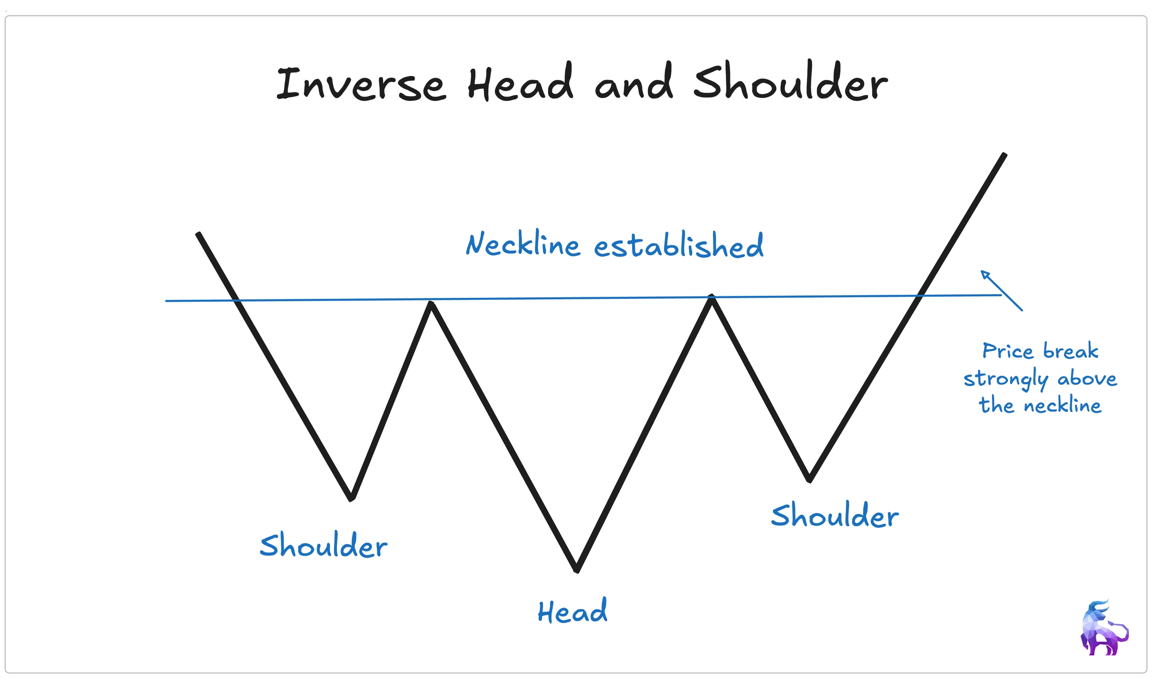
Inverse Head and Shoulder
The inverse head and shoulders are the opposite — it signals a potential downtrend reversal into an uptrend. Instead of peaks, the price forms three valleys: a left shoulder, a lower head, and a right shoulder that fails to push lower.
Just like the regular pattern, it won’t be textbook perfect. The lows might not be exactly the same, the neckline could be tilted, and the right shoulder may form higher or lower than the left. The key is to focus on the bigger picture.
The neckline connects the highest points between the shoulders and the head. A breakout above the neckline with strong buying pressure confirms the pattern. No break, no trade.
Chart patterns can give you clues about where the market might go, but they shouldn’t be traded alone. Just because a pattern forms doesn’t mean the price will always move as expected. They should be used along with support and resistance, volume, and overall market trends
Patterns are a useful tool, but they work best when combined with other factors, not on their own.
Psychology Behind the Pattern Inverse head and shoulder Pattern
In a downtrend, sellers are in control. The price keeps falling, and bearish momentum is strong.
The left shoulder forms as the price makes a low and bounces slightly. Then comes the head, where the price drops to a new low, showing that sellers are still active.
But here’s where things start to shift.
After that deep drop, the price bounces again and forms the right shoulder — but this time, it doesn’t fall as low as before. That’s a sign that selling pressure is weakening. Buyers are starting to step in and hold the price up.
When the price pushes higher and breaks the neckline, it signals that the downtrend might be over. Traders who were short now find themselves stuck. They’re losing money and need to get out, which means buying back their positions. That buying — combined with new traders jumping in — adds even more fuel to the move up.
Triangle Patterns
Triangle patterns are continuation patterns. That means they usually show up when the market is already trending, and they tell us the trend is just taking a quick break before moving again.
You can think of it like this: price is resting, gathering energy, and getting ready for its next move. That move can be up or down, depending on who wins the battle between buyers and sellers.
There are three main types of triangle patterns:
- Ascending Triangle
- Descending Triangle
- Symmetrical Triangle
Let’s break down each one
Ascending Triangle
An ascending triangle shows strong buying pressure — but there’s a clear resistance level price can’t seem to break… yet.
Here’s how it forms:
- The top of the triangle is flat. That’s the resistance level where sellers are holding strong.
- But the lows keep getting higher. That means buyers are stepping in earlier each time — creating higher lows.
This tightens the range. Buyers keep pushing, and eventually, the pressure becomes too much. When price finally breaks above resistance with strong volume, that’s the breakout — and it often leads to a sharp move higher.
Psychology Behind the Pattern
Buyers are getting more aggressive. Each time the price dips, they jump in sooner. That shows confidence. Sellers are trying to hold the line at resistance, but eventually they get overwhelmed. The breakout happens when buyers finally take control — and often leads to a powerful rally.
Descending Triangle
A descending triangle is the opposite. It shows strong selling pressure — but buyers are trying to hold a support level.
Here’s what it looks like:
- The bottom of the triangle is flat. That’s the support level buyers are defending.
- But the highs keep getting lower. Sellers are stepping in earlier and earlier, creating lower highs.
This builds pressure. If buyers can’t hold the support level, price breaks down — often leading to a sharp sell-off.
Psychology Behind the Pattern
Sellers are in control. They’re not letting price bounce as high with each rally. Meanwhile, buyers are holding on at support — but they’re losing strength. Once support breaks, it often triggers stop-losses and panic selling, driving the price even lower.
Symmetrical Triangle
The symmetrical triangle is a tug-of-war. Neither side is clearly winning yet.
Here’s how it works:
- Lower highs from the sellers.
- Higher lows from the buyers.
This squeezes the price into a tighter and tighter range. It looks like a wedge, and as the triangle gets closer to the point, something has to give. When price finally breaks out or breaks down, that’s the signal.
The breakout can go in either direction — up or down — so don’t assume. Wait for confirmation with a strong candle and volume.
Psychology Behind the Pattern
It’s a battle between buyers and sellers. Both sides are holding ground, and the market is getting more and more undecided. Once one side gives in, the other side takes over — fast. That’s why symmetrical triangles can lead to big breakouts or breakdowns. You just have to be patient and wait for confirmation.
Cup and Handle
The Cup and Handle is a continuation pattern. That means the trend is already moving in one direction—usually upward—and then takes a break before continuing higher. The pause in the trend forms the pattern: first a round, bowl-like shape (the cup), followed by a small pullback (the handle).
So why is it called a Cup and Handle? Because on a chart, it literally looks like one. The cup forms as the price gently dips and then climbs back up. Then, the handle forms as the price pulls back slightly before breaking out again.
How It Forms
- The price is moving in an uptrend.
- It pulls back and forms a smooth, rounded bottom—the cup.
- Then the price bounces up, but instead of breaking out right away, it pulls back again, creating a short consolidation—the handle.
- Once the price breaks out above the high of the cup, the pattern is confirmed.
This pattern often shows up on larger timeframes and can take weeks or even months to fully form.
Where to Enter
The typical entry is when the price breaks above the handle or the cup’s previous high. A stop-loss can go just below the handle. The breakout should come with strong volume and momentum to confirm the move.

Psychology Behind the Cup and Handle Patterns
This pattern forms when a stock is in a strong trend but loses some momentum. Buyers stop pushing, and sellers don’t really step in with force either. The result? A gentle pullback that forms the rounded cup.
As price starts to rise again, some traders who bought earlier may take profits. Others might short, thinking the uptrend is over. That creates the handle, a short pullback.
Then, when the price breaks above the cup’s high, it triggers those short sellers to cover and new buyers to jump in, leading to a breakout.
Inverse Cup and Handle
The Inverse Cup and Handle is just the opposite. It’s a bearish continuation pattern. Instead of signaling a move higher, it suggests the downtrend is taking a break, and then likely continuing even lower.
How It Forms
- The stock is already in a downtrend.
- The price bounces a bit and forms an upside-down U shape — this is the inverse cup.
- Then it pulls back slightly upward, creating the handle, like a bear flag.
- The pattern is confirmed once the price breaks below the support level formed at the bottom of the cup.
Just like the regular version, this pattern is often found on higher timeframes and takes time to form.
Entry and Exit
Once the pattern completes and price breaks support, a short entry is triggered. Stop-loss placement depends on the setup, but it’s usually placed just above the handle or the breakdown candle.

How to Trade Chart Patterns the Right Way
Trading chart patterns properly is more than just spotting a shape and placing a trade. You need a step-by-step approach:
Spot the Pattern
First, identify a clear chart pattern forming on the chart. Make sure it actually looks like a real pattern and not just random price movement.
Check Volume and Trend
A pattern is more reliable if it’s supported by strong volume.
If volume is high, it means more traders are involved, making the move stronger.
If volume is low, the pattern may be weak and could fail.
Also, check if the stock is moving with the overall market trend. A bullish pattern in a bearish market might not work well.
Look at Bigger Timeframes
Don’t just focus on one small timeframe. Zoom out!
A pattern might look strong on a 5-minute chart, but if the hourly or daily chart shows the opposite, it may not work.
Plan Your Trade
Before entering, set up a plan:
Where will you buy or sell?
Where will you exit if the trade goes wrong?
Where will you take profits?
Having a plan helps you stay disciplined and avoid emotional mistakes.
Take the Trade and Stick to the Plan
Once everything lines up, take the trade. Don’t jump in too early, and don’t ignore your stop-loss if the trade doesn’t work out.
Key Takeaways
- Chart patterns are visual price formations that suggest potential market direction — either trend continuation or reversal.
- Patterns reflect the battle between buyers and sellers and work across all timeframes.
- They should never be traded in isolation — always confirm with volume, trend, and key price levels.
- Continuation patterns (like triangles and rectangles) suggest the trend may resume after a pause.
- Reversal patterns (like double tops/bottoms, head and shoulders) signal a potential shift in trend direction.
- Common patterns include: Rectangle, Double Top/Bottom, Triple Top/Bottom, Head and Shoulders, Triangles, and Cup & Handle.
- Each pattern has its own psychology — showing where buyers or sellers are gaining or losing strength.
- Volume plays a key role: strong volume confirms the validity of a breakout or breakdown from the pattern.
- Higher timeframes provide more reliable patterns than short-term charts.
- Always have a trade plan: define entry, stop-loss, and target before entering any pattern-based setup.
- Patterns are tools, not signals — they work best when used with market context, not alone.


