The First Tool We’re Covering: Footprint Charts
A footprint chart is like an X-ray of the market. Instead of just showing where the price moved, it reveals what happened inside each candlestick — who was buying, who was selling, and at what price levels.
Unlike regular charts that only show price movement, footprint charts display executed orders, breaking down the action inside each candle:
Market Buys – Orders that were executed at the ask price.
Market Sells – Orders that were executed at the bid price.
This allows traders to see:
- The exact volume traded at each price level.
- Whether buyers or sellers were in control.
- Where large orders are stepping in.
- If a breakout has strong participation or is weak.
Here is a visual representation of a footprint chart. It might look confusing at first, but we will break it down.
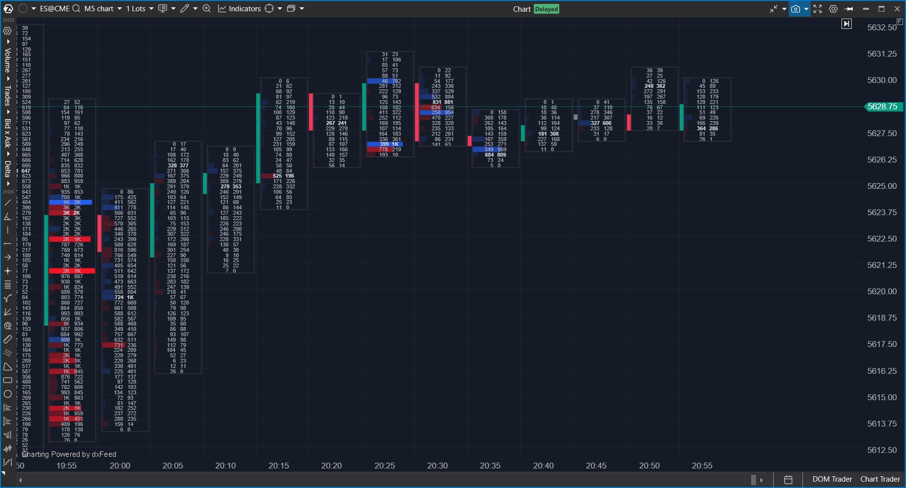
How a Footprint Chart is Different from a Candlestick Chart
A candlestick chart shows the basics of price movement — where it opened, where it closed, and the highest and lowest points it reached.
But that’s all it tells you.
It doesn’t show how much buying and selling happened inside the candle. It doesn’t tell you whether buyers or sellers were in control. And it doesn’t reveal where big traders stepped in.
A footprint chart, on the other hand, goes beyond just price movement. It shows the real battle between buyers and sellers at every price level. Instead of just seeing where the price moved, you can see exactly how much volume traded and who was more aggressive — the buyers hitting the ask or the sellers hitting the bid.
While candlesticks give a summary, footprint charts show the full story of what happened inside each candle.
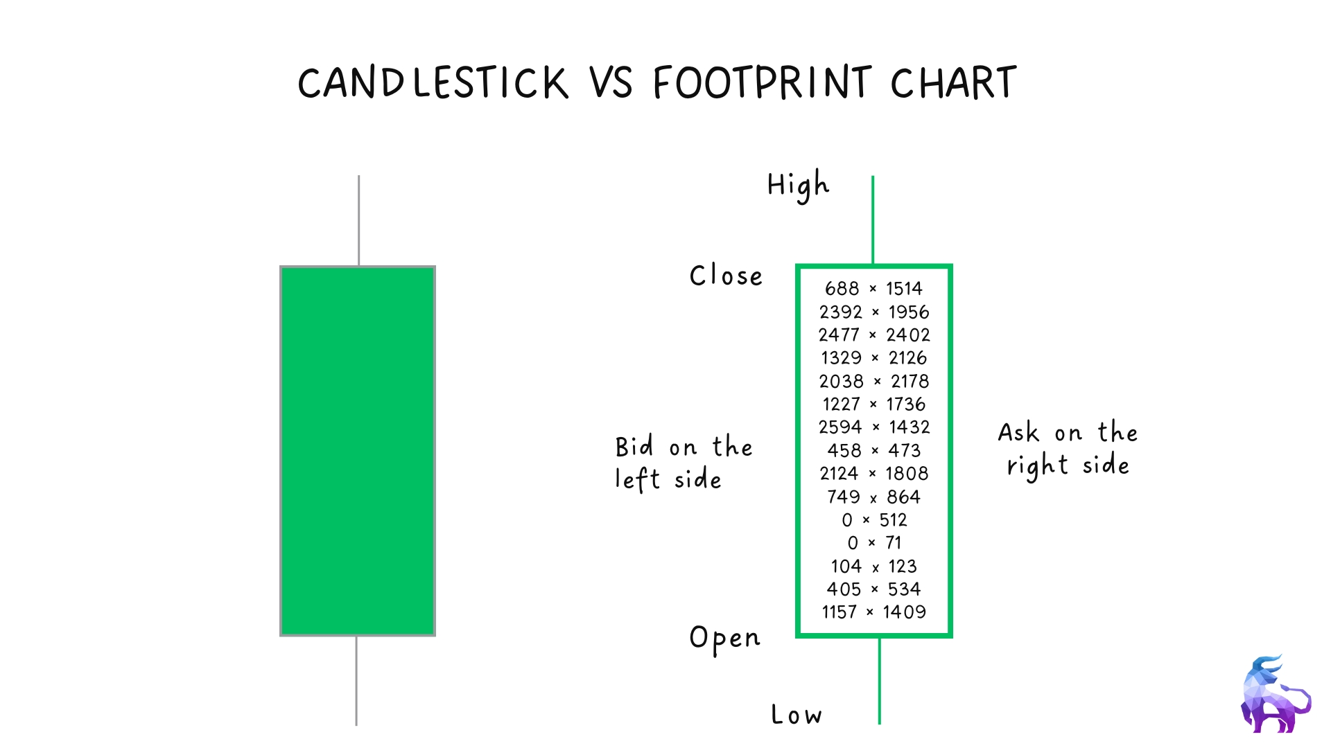
Breaking Down the Footprint Chart
A footprint chart gives a deeper look inside each candlestick. Instead of just showing where the price moved, it shows how much buying and selling happened at each price level.
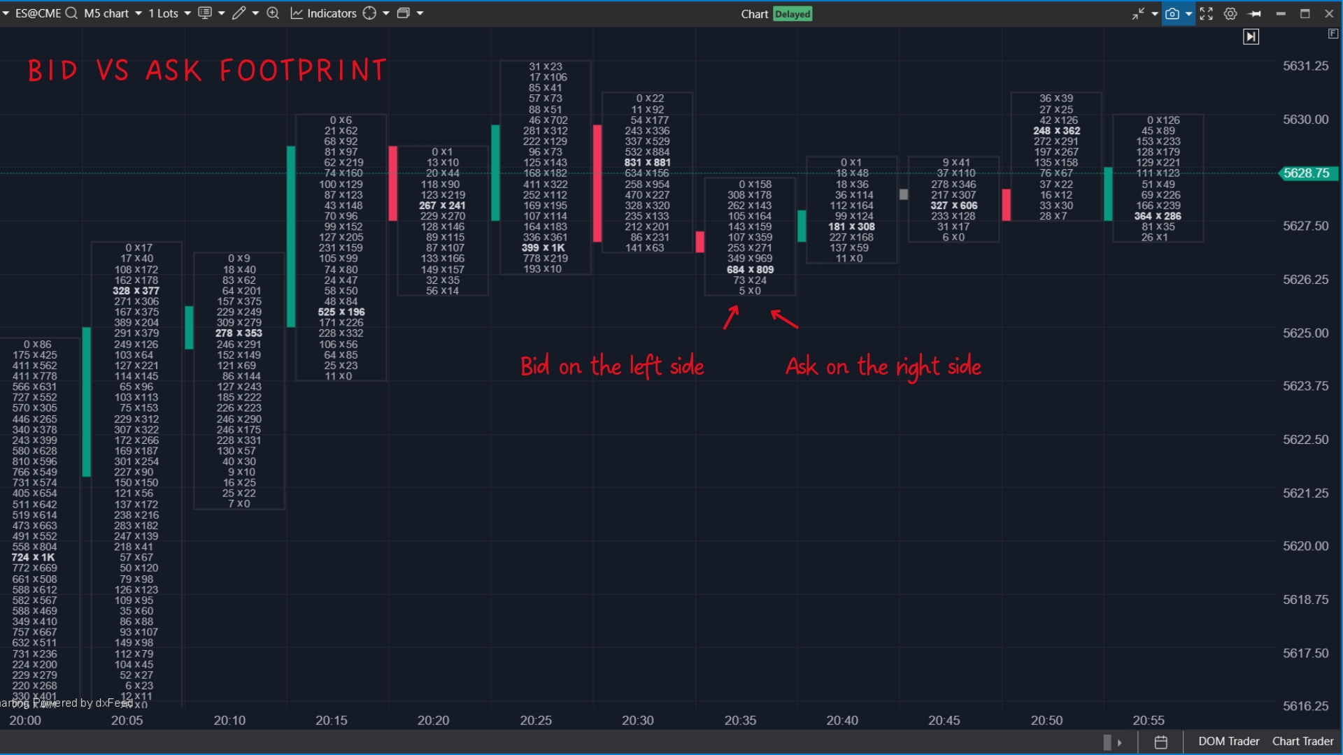
Each footprint bar is structured like this:
- Bids are on the left side.
- Ask on the right side.
The left side shows how many sell orders were placed at the bid price. These are sellers who want to sell immediately.
The right side shows how many buy orders were placed at the ask price. These are buyers who want to buy immediately.
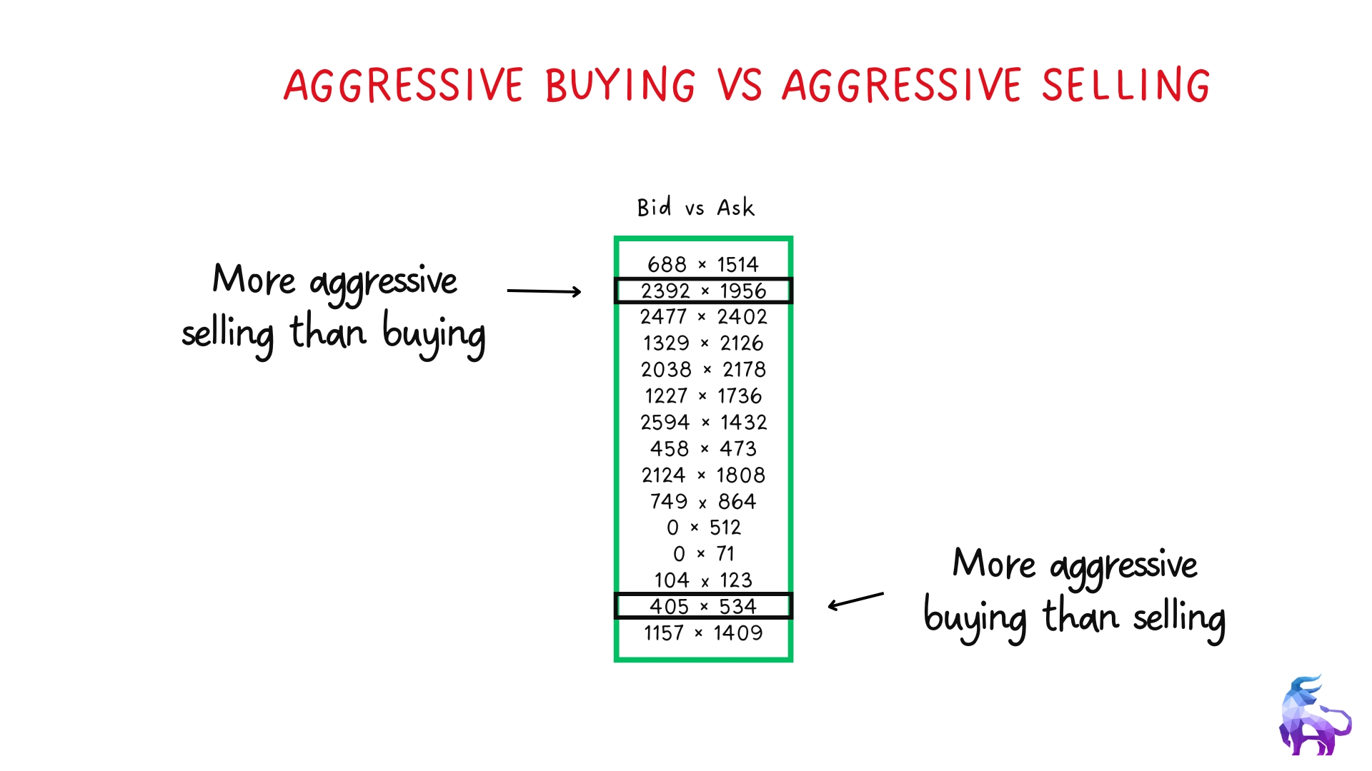
Aggressive buying vs Aggressive selling
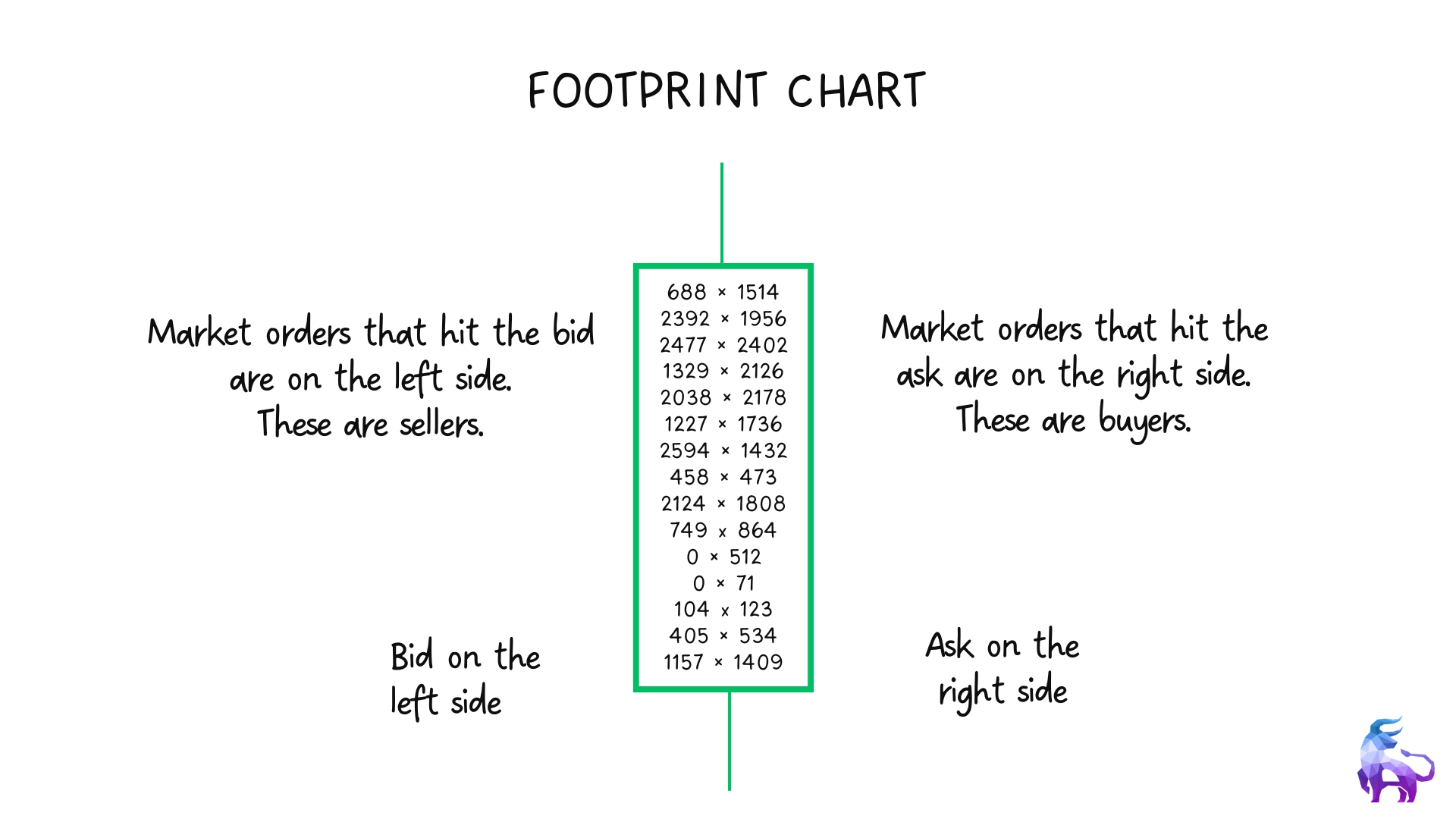
Before looking at footprint charts in action, let’s first understand the basics of aggressive buying and selling with a simple example.
In the image below, you can see different price levels where more contracts were either bought or sold aggressively.
By analyzing this, traders can see where buying or selling pressure is stronger, which helps identify key areas of interest in the market.
To understand how aggressive buying and selling appear on a footprint chart, let’s look at an example.
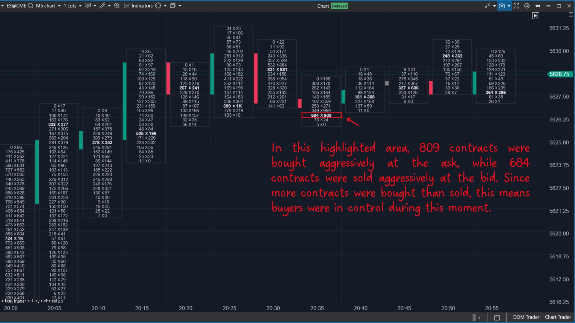
In the image above, the highlighted area shows 809 contracts were bought aggressively at the ask, while 684 contracts were sold aggressively at the bid. Since more contracts were bought than sold, it indicates that buyers were in control at the time.
This example helps illustrate how footprint charts reveal who is being more aggressive — buyers or sellers at each price level.
However, a single instance of aggressive buying or selling doesn’t always mean the market will continue in that direction. It’s important to look at the bigger picture, such as whether buyers or sellers are consistently dominating over multiple candles, how delta behaves, and whether price follows through or gets absorbed.
Type of footprint charts
There are different types of footprint charts that you can use and customize based on what you want to see in the market. While all footprint charts provide insights into order flow, they focus on different aspects of buying and selling activity. Let’s go over the most commonly used types.
Bid x Ask Footprint Chart
The Bid x Ask footprint chart gives a direct look at the battle between buyers and sellers at each price level. It displays:
Bid Volume (Left Side) – The number of contracts sold at the bid price (aggressive selling).
Ask Volume (Right Side) – The number of contracts bought at the ask price (aggressive buying).
This chart helps traders see where buyers or sellers were more aggressive. If more contracts were traded at the ask, buyers were in control. If more were traded at the bid, sellers dominated. It’s useful for spotting key price levels where buyers or sellers stepped in with strong conviction.
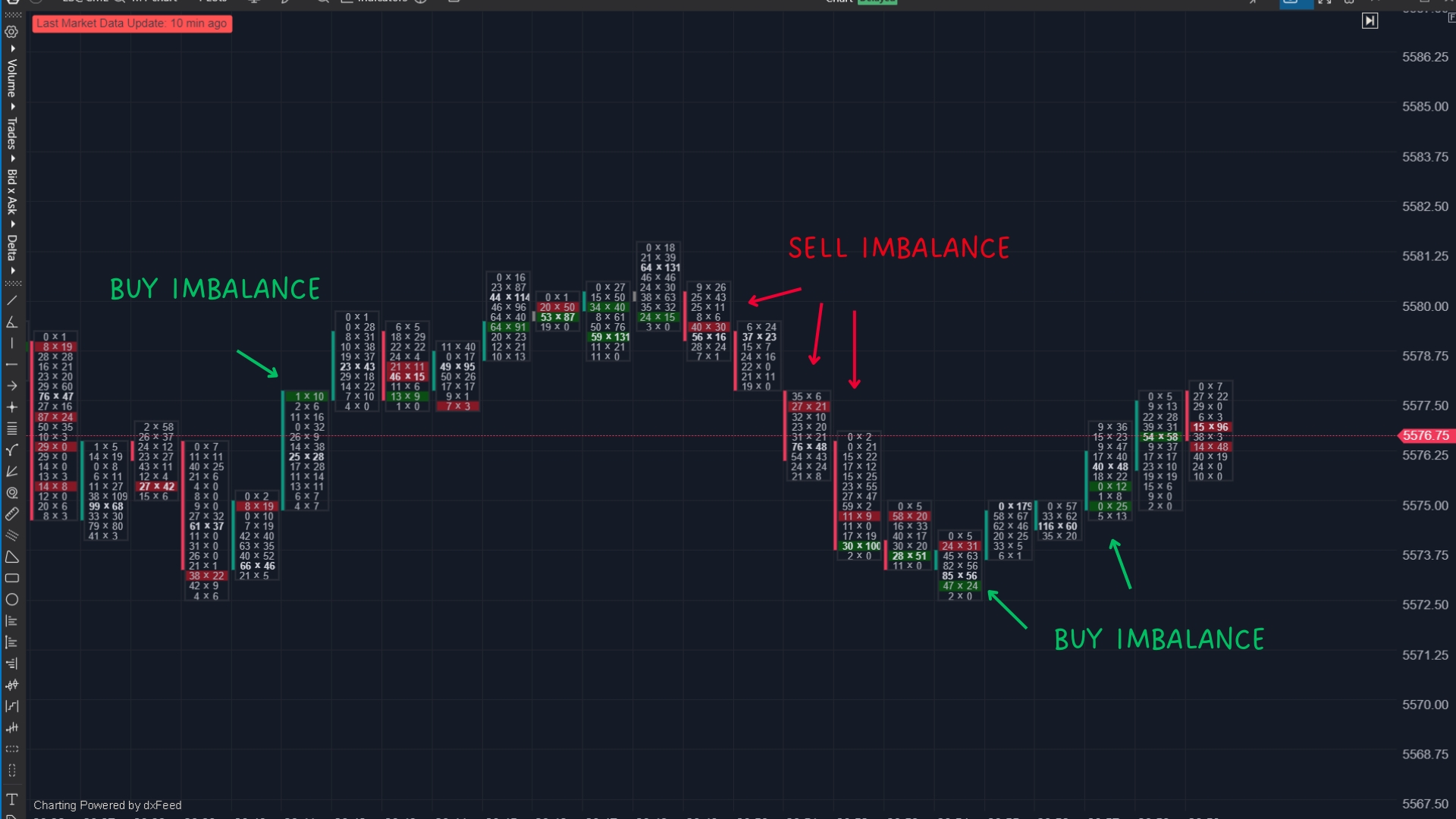
Buy and Sell Imbalances
Buy and sell imbalances occur when there is a significant difference between the number of contracts traded at the bid versus the ask. This helps traders identify areas where aggressive buyers or sellers are dominating, which can indicate potential support, resistance, or future price movement.
How Are Imbalances Calculated?
Imbalances are calculated diagonally on the footprint chart:
Buy Imbalance: The volume traded at the ask is compared to the volume traded at the bid one level below.
Sell Imbalance: The volume traded at the bid is compared to the volume traded at the ask one level above.On a footprint chart, imbalances appear when trade volume at the bid or ask is significantly greater than its corresponding side. The imbalance percentage threshold is customizable, but in this case, it only highlights levels where the imbalance is over 300%.

Buy Imbalance: More aggressive buying occurred at the ask than selling at the bid.
Sell Imbalance: More aggressive selling occurred at the bid than buying at the ask.
These imbalances reveal where traders urgently want to enter or exit positions, often leading to momentum shifts or key reaction points in the market.
Your trading tool will automatically highlight these imbalances based on the settings you choose. You can adjust the imbalance threshold to highlight only the most significant areas of buying and selling pressure, making it easier to spot key market levels where price may react.
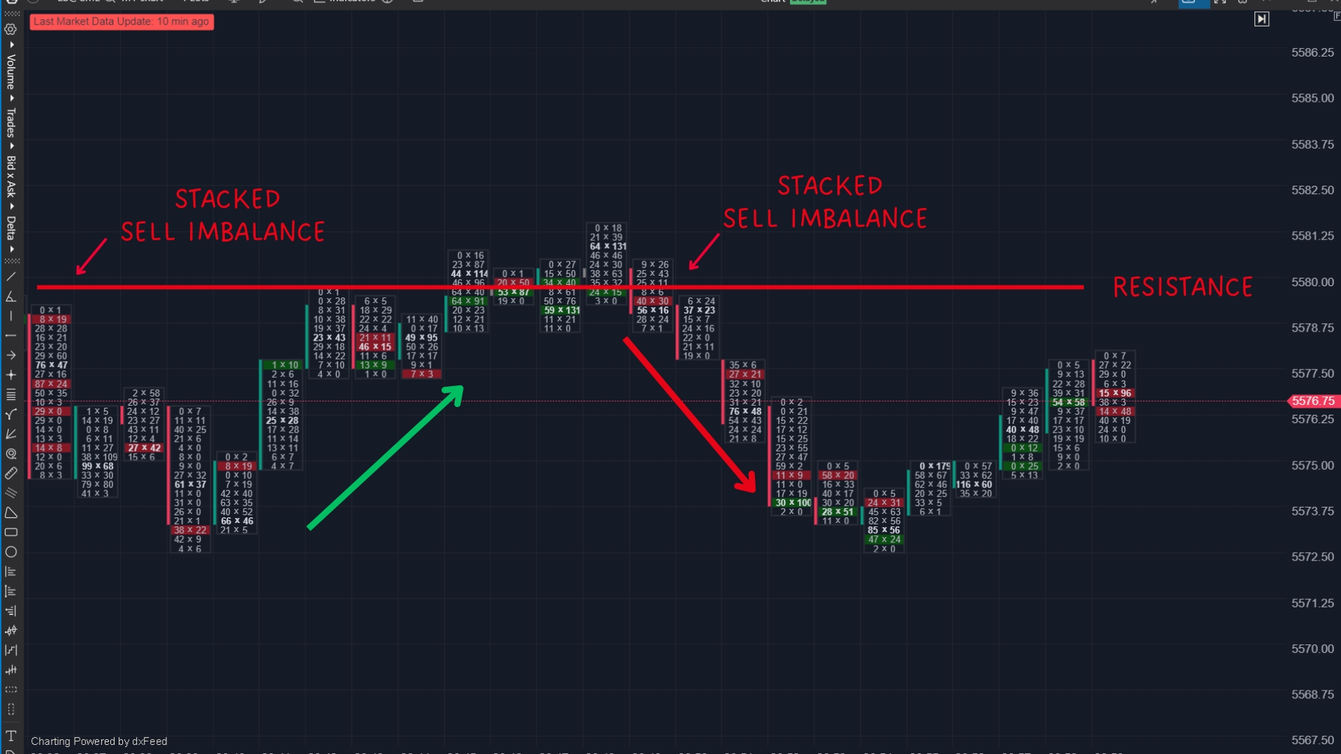
Stacked Imbalances
A stacked imbalance occurs when multiple buy or sell imbalances appear in a row within a tight range. This indicates strong pressure in one direction, often forming key support or resistance zones where price may react if revisited.
Stacked Buy Imbalances (Support Zones):
- Multiple buy imbalances appear across consecutive price levels.
- These areas can act as support if the price revisits, as buyers previously stepped in aggressively.
- Traders look for retracements to these levels for potential long trades.
Stacked Sell Imbalances (Resistance Zones):
- Multiple sell imbalances appear across consecutive price levels.
- These areas can act as resistance, as sellers were previously in control.
- Traders look for the price to retest these levels for potential short trades.
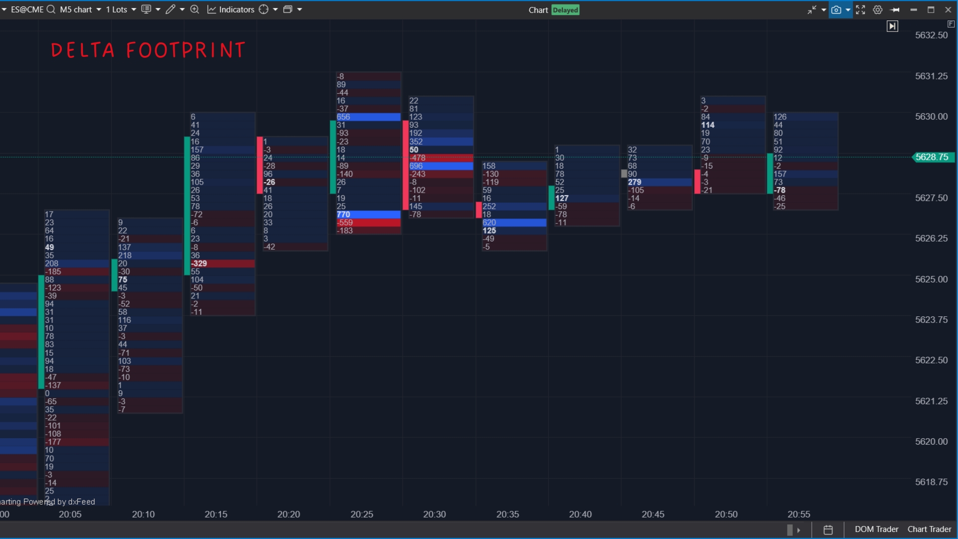
Delta Footprint Chart
The Delta Footprint Chart focuses on the difference between buying and selling pressure at each price level.
Volume Delta = Offer Volume – Bid Volume
Instead of showing bid and ask separately, it calculates the net buying or selling activity:
If the delta is positive, buyers are the aggressor, as more contracts were bought at the ask than sold at the bid.
If the delta is negative, sellers are the aggressor, as more contracts were sold at the bid than bought at the ask.
- A positive delta means more aggressive buyers.
- A negative delta means more aggressive sellers.
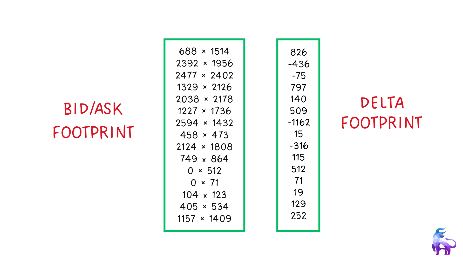
The bid/ask footprint seen above is the exact same candle as the delta candle on the right.
Here’s How Delta Looks on the Chart.
Traders use delta to confirm trends, spot exhaustion, and identify potential reversals.
A positive delta does not always mean strong buying, and a negative delta does not always mean strong selling. Sometimes, aggressive buyers or sellers get absorbed by larger limit orders, causing delta divergence, where the price does not follow the delta.
Delta Divergence
Delta divergence happens when price and delta don’t move together. Normally, if buyers are aggressively hitting the ask, the price should rise, and if sellers are aggressively hitting the bid, the price should fall. When this doesn’t happen, it signals absorption by larger limit orders, often leading to a reversal or a trap.
Bullish Delta Divergence (Absorption by Buyers)
- Delta is negative (more aggressive selling), but the price holds or moves up.
- Large buyers are absorbing the sell orders, preventing the price from dropping.
- On a footprint chart, strong selling at the bid appears, but the price refuses to go lower.
Bearish Delta Divergence (Absorption by Sellers)
- Delta is positive (more aggressive buying), but the price stays flat or moves down.
- Large sellers are absorbing the buying pressure, stopping the price from rising.
- Footprint charts will show strong buying at the ask, but the price struggles to go higher.
If the delta is strong but the price isn’t moving, aggressive traders may be getting absorbed by larger players. When absorption continues, price often moves in the opposite direction as those traders get forced to exit, creating a fast reversal. Recognizing delta divergence early helps traders avoid getting trapped and position themselves before the move happens.
Volume Footprint Chart
The Volume Footprint Chart highlights the total trading activity at each price level. Instead of splitting bid and ask, it simply shows how much volume was traded at a particular price.
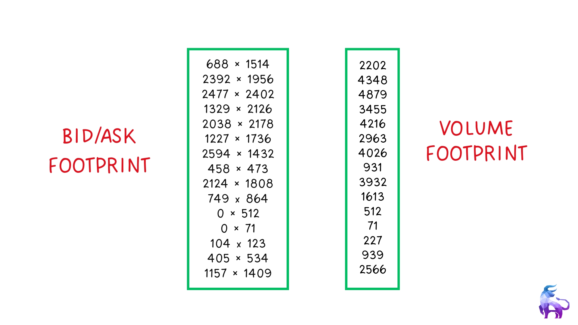
Here’s how the volume looks on the Chart.
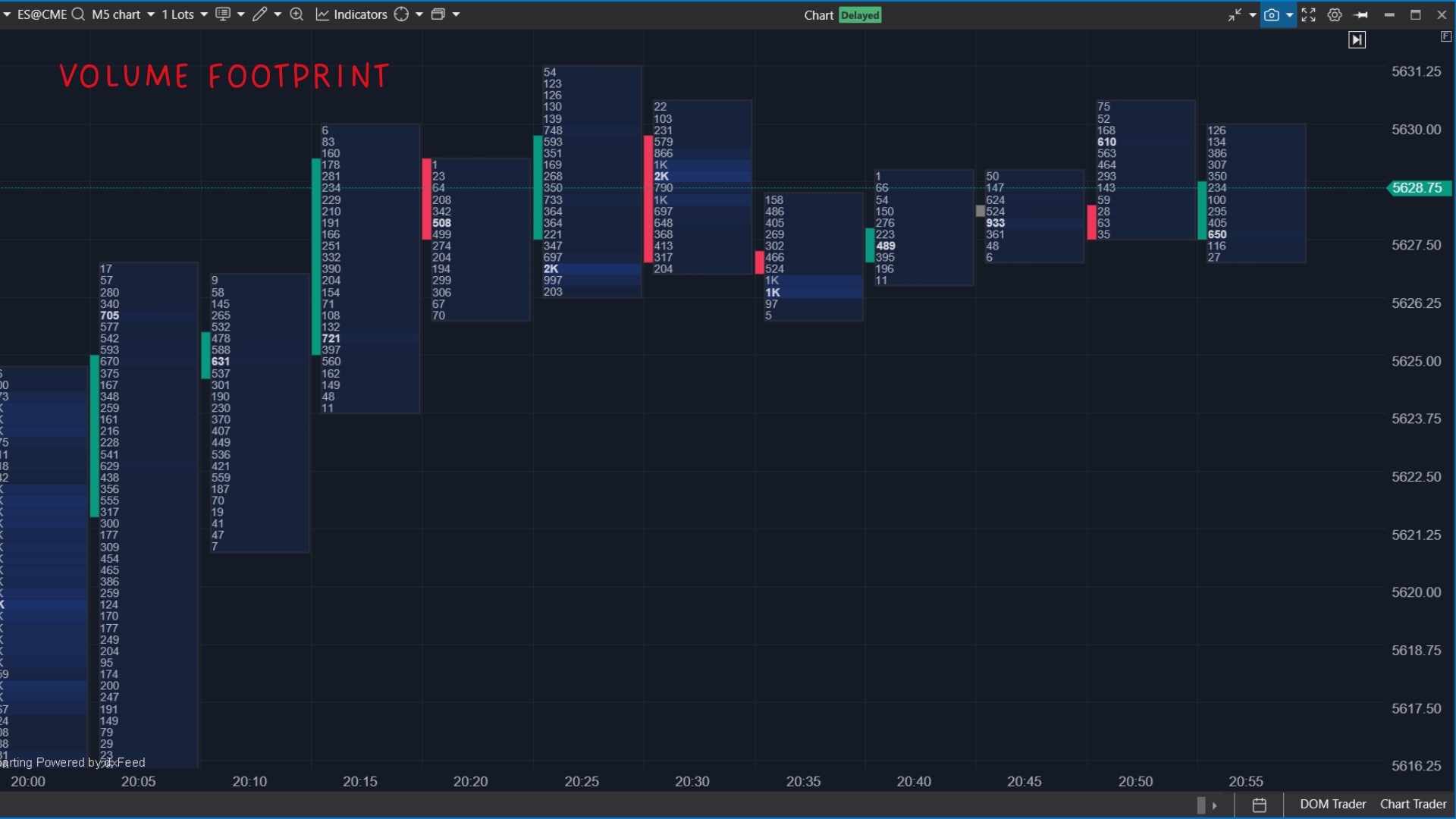
This type of footprint chart helps identify areas where big traders are active and where significant market participation occurs. High-volume areas often act as support or resistance levels, as they indicate strong interest from market participants.
Customizing Your Footprint Chart
One of the best things about footprint charts is that you can customize them based on what you want to see. Some traders prefer to focus on bid vs. ask volume, while others use delta or total volume footprints to analyze buying and selling pressure.
You can adjust settings to display multiple footprint data points on the same chart, allowing you to track order flow in a way that best fits your trading style.
Finished & Unfinished Auctions
In trading, price moves through an auction process where buyers and sellers compete at different price levels. Every time the price reaches a new high or low, it’s like an auction coming to an end — either the buyers or sellers give up, or the battle continues.
Footprint charts make it easy to see whether an auction is truly finished or if the price is likely to come back and test that level again. This is where finished and unfinished auctions come in.
Finished Auction
Finished Auctions: When the Market Decides It’s Done.
A finished auction happens when the price reaches a high or low, and there’s no significant interest left to continue trading at that level. Buyers or sellers have exhausted their efforts, making it less likely for the price to extend further in that direction.
You can spot a finished auction on a footprint chart when a price extreme (the high or low of a move) has zero trades on one side.
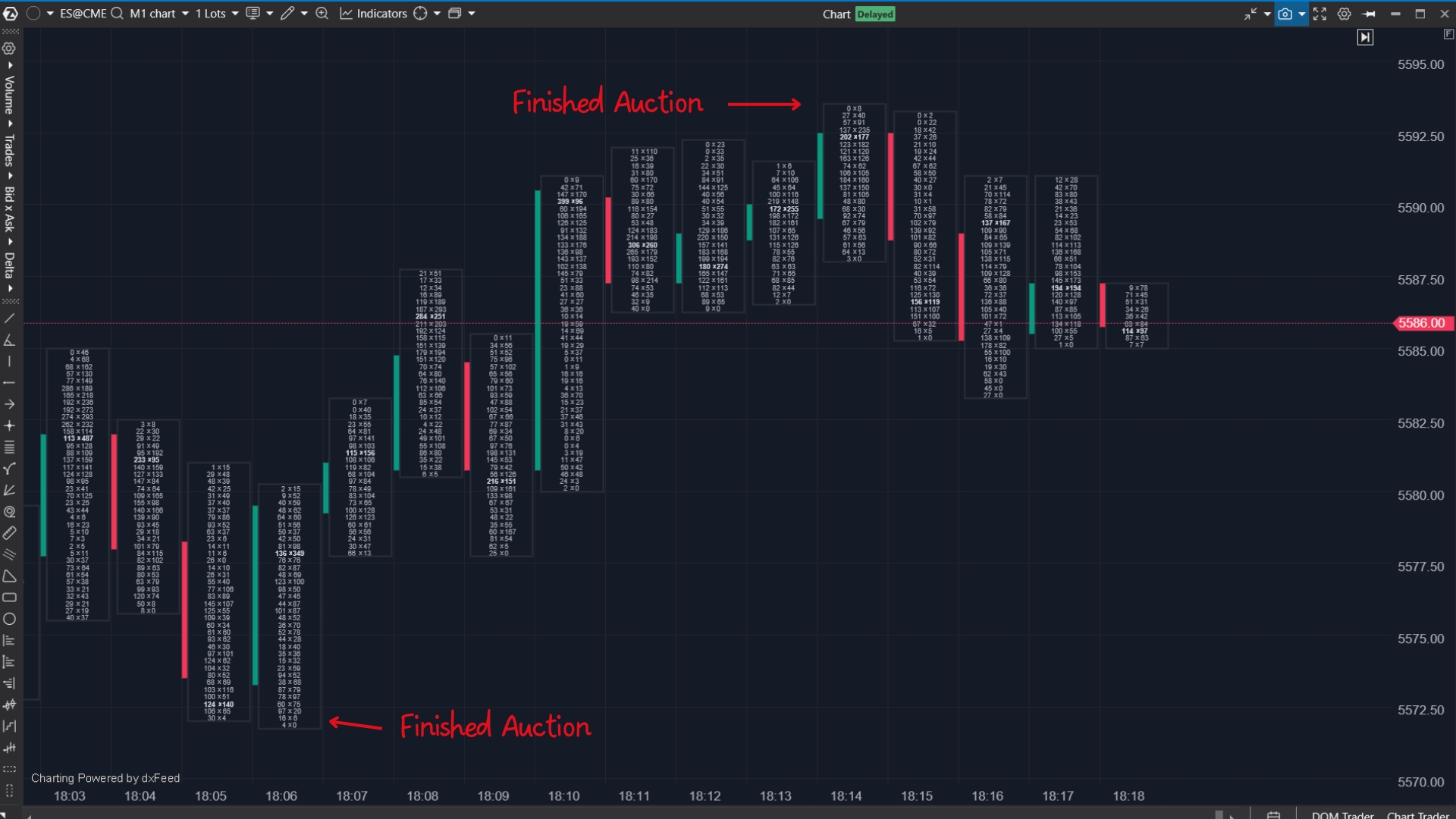
For example:
If the price rallies to a new high and there are no bid trades left, buyers will stop buying. The auction is over, and the price is likely to reverse.
If the price drops to a new low and there are no ask trades left, sellers have given up, and the price may bounce.
Finished auctions are useful for spotting potential reversals. If buyers couldn’t push the price higher, demand dried up, and the price may move lower. If sellers fail to push the price down, supply has been exhausted, and the price may move back up.
However, just because you see a finished auction doesn’t mean the price will automatically reverse. The market can still push further if large traders step in with new orders. A finished auction is a clue, not a guarantee.
Unfinished Auction
Unfinished Auctions: When the Market Leaves Loose Ends
An unfinished auction happens when the price reaches a high or low, but both buy and sell orders are still present. This means the auction wasn’t truly completed, and there’s a good chance the price will come back to that level later.
On a footprint chart, you can identify an unfinished auction when both bid and ask trades are still active at the high or low of a move. This means traders were still willing to buy and sell at that level, leaving unfinished business.
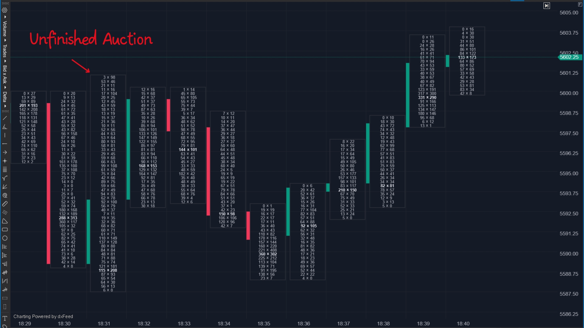
Unfinished auctions often act like magnets. Since the market didn’t fully close out activity at that level, the price may come back to finish the job before making a real move in the opposite direction.
That being said, just because you see an unfinished auction doesn’t mean the price will immediately revisit that level. While unfinished auctions often attract price back, the market could continue trending for an extended period before returning. It’s just one factor to consider in the bigger picture.
Why Finished and Unfinished Auctions Matter for Trading
Understanding finished, and unfinished auctions help traders make better decisions about entry, exit, and trend continuation.
- A finished auction at the high means buyers gave up — the price may reverse lower.
- A finished auction at the low level means sellers ran out of steam so that the price may move back up.
- An unfinished auction means the price could return to that level before continuing.
This is why unfinished auctions can be useful as take-profit levels. If you’re in a trade and see an unfinished auction ahead, it might be a smart target for your exit since the market often revisits those areas.
On the other hand, a finished auction can confirm the end of a move, helping traders avoid chasing the price at the wrong time.
However, trading is not as simple as following a rule that says, "if there’s a finished auction, the price will reverse,” or “if there’s an unfinished auction, the price will come back.”
The market is more complex, and while these concepts are useful, they should be used in combination with other order flow signals, market context, and volume analysis.
Putting It All Together
Finished and unfinished auctions are part of the market’s natural auction process.
- A finished auction means the price has reached its limit and may reverse.
- An unfinished auction means there’s still business to take care of, and the price may come back.
By using footprint charts to identify these areas, traders can improve their ability to predict price movement, set better targets, and avoid getting caught in weak reversals. But as with any trading tool, context is key — finished and unfinished auctions should be used alongside other order flow data, not as standalone signals.
Absorption
Absorption occurs when aggressive market orders meet strong passive limit orders, preventing the price from moving further in that direction. It happens when aggressive buyers or sellers try to push the market but get absorbed by larger resting orders, leading to a stall or reversal.
There are two main types:
Buy Absorption (Sell Wall): Buyers keep hitting the ask, but the price fails to move up because a large seller is absorbing buy orders.
Sell Absorption (Buy Wall): Sellers keep hitting the bid, but the price fails to move down because a large buyer is absorbing sell orders.
When absorption occurs, price movement slows down, and the aggressive traders may eventually give up, leading to a potential reversal.
How to Spot Absorption on Footprint Charts
Footprint charts allow traders to see absorption by displaying the number of contracts traded at each price level. Key signs of absorption include:
Large Volume at a Specific Price Level
If a high number of buy orders hit the ask, but the price doesn’t move up, a passive seller is absorbing demand.
If a high number of sell orders hit the bid but the price doesn’t move down, a passive buyer is absorbing supply.
Delta Shows Aggressive Buying or Selling, but Price Stalls
A positive delta (more buying at the ask) with no upward price movement suggests buy absorption – sellers are preventing further upside.
A negative delta (more selling at the bid) with no downward price movement suggests sell absorption – buyers are preventing further downside.
Price Remains Stuck in a Tight Range
If the price is stuck at a level with aggressive trading on one side but no significant movement, absorption is occurring.
This often happens at support, resistance, or key liquidity areas where large traders place orders.
Stacked Imbalances That Don’t Lead to a Breakout
A stacked buy imbalance at resistance, but price isn’t moving up, suggests heavy limit sell orders are absorbing buying pressure.
A stacked sell imbalance at support, but price isn’t moving lower, suggests buyers are stepping in with large limit orders to stop the decline.
Unfinished Auctions at Key Levels
If the price reaches a high or low but still has both bid and ask volume at that extreme, it means traders were still willing to trade at that level.
This often happens at absorption zones and suggests that the price may return to that level to complete the auction before making a decisive move.
What Happens After Absorption?
Reversal: If buyers are absorbing aggressive selling at support, the price may bounce. If sellers are absorbing aggressive buying at resistance, the price may drop.
Breakout Failure: If a breakout attempt is met with absorption, it’s likely to fail, trapping traders who entered late.
Price Revisit: If absorption creates an unfinished auction, the price may come back to that level before making a real move.
Exhaustion
Exhaustion happens when aggressive buyers or sellers push the market in one direction but start running out of strength. You’ll often see this at key levels where price struggles to keep moving despite strong market orders. When exhaustion sets in, it can signal a reversal or a pause in the trend.
How to Spot Exhaustion in Footprint Charts
Price Moves, But Delta Weakens
If the price keeps pushing higher, but the delta (buying pressure) starts to fade, it means that the buyers are running out of steam.
The same goes for sellers — if the price is dropping, but the delta is shrinking, sellers are losing control.
Volume Drops at Key Levels
A strong move into resistance or support should have good volume behind it.
If volume dries up as price reaches a level, it shows fewer traders are willing to buy or sell, making a reversal more likely.
Unfinished Auctions at Highs or Lows
When a new high or low forms but still has bid and ask volume, it means traders are hesitating.
This often suggests the move wasn’t strong enough to fully clear out orders, leaving unfinished business.
What Happens When Exhaustion Kicks In?
Reversals – If aggressive traders can’t move the price further, the other side may step in and push the price in the opposite direction.
Sideways Movement – If neither buyers nor sellers take control, the price may stall and chop around before making its next move.
How to Use Exhaustion
Spotting Reversals – If you see exhaustion at a key level, it could be a sign that the trend is about to shift.
Taking Profits – If you’re in a trade and notice exhaustion setting in, it might be a good time to lock in gains.
Avoiding Bad Entries – Chasing a move that’s losing steam is a common mistake. Recognizing exhaustion helps traders avoid getting caught in weak breakouts or breakdowns.
Understanding exhaustion in footprint charts helps traders know when momentum is fading, giving them an edge in decision-making. Instead of blindly following price, they can read the order flow and see when traders are losing conviction.


